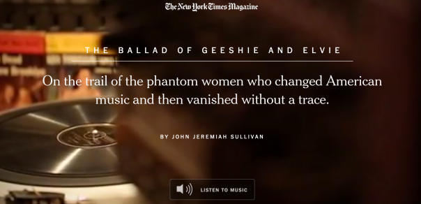
It’s a story about two female African-American musicians from the early 20th century. They have angelic voice but are rarely known by the public. Their records are few and their stories are no where to find—It’s a story about music and myth, and it’s ingeniously presented by the New York Times Magazine.
Since it’s a story about music, the article embedded music from the two musicians’ recordings. There are seven songs free for listening at the end of the article, which echoes the beginning. The article contains a few names of their songs and some line of the lyrics when introducing the music style of the two women, and I find it helpful to understand the context when having the corresponding music during reading. I like the producer’s effort in typing the lyrics out and showing them in the videos when the songs are played—It feels like watching a music video.
The layout is clear and well arranged. It’s essential to keep the style simple when you have so many things to present—videos, photos, captions, interviews and music. I noticed that the color of videos and photos are almost in the same tone—a faded brown or grey, which brings out a sense of past, and also matches with the style of the music. The photos are very carefully sized—not too large, not too small, nothing abrupt. The coherence is also in the opening image of the videos—they usually start with leaves and branches, and then move forward into the topic related to the context.
The story uses their songs to introduce the story behind the two mysterious musician, and there is no better way of doing it than showing the readers their music. The New York Times Magazine managed to do it, and they did it in an artistic and elegant way.
http://www.nytimes.com/interactive/2014/04/13/magazine/blues.html?_r=1

I really love this project, not only because of the story it told, but also the way it was displayed. I agree with you that the project is done in an artistic and elegant way. All the elements there, the photos, the videos, are in coherent with each other. As you noticed, they share the same style. The project itself also became part of the story.
It’s a story about music, so by inserting music from the two musicians, readers can “listen” to the story behind that. This is the best way to do it. It’s more attractive than texts and it will enhance user experience. Also, I noticed that when you move from the video to the text part, the music will stop automatically, which helps you focus more on the story instead of getting lost.
But you didn’t mention any drawbacks of this project. The style is good as a whole, but I think it should still include some more realistic photos, some more directly related to the two characters. Then readers can understand more about them and their work. It’s still a feature story rather than an art project.
LikeLiked by 1 person
I like the sound or music design in this project too. It improves the reading experience, that is people love to enjoy.
LikeLike
I loved the use of music in this design as well. In fact the entire piece was very clean, and the photos sporadically disbursed throughout the text to break it up kept me scrolling, because I wasn’t intimidated by a giant wall of text.
In the music sections, I also really liked how the words appeared and faded away, almost like a sing-a-long, but without being so campy.
However, I wish the music had continued playing as I scrolled. I wanted to listen to the song all the way through, but I also wanted to read the story, and I felt like I had to choose one or the other. I think instead, keeping the music playing while scrolling but giving the reader the chance to pause the music at any time would have been a better way to share the music.
LikeLike